Times are changing for every car maker. There is an electric surge across the world. New manufacturers are usurping the stalwarts of the last 50 years. New technologies abound. So what is the answer for the ‘old’ marques? Well, one answer is try to reinvent yourself.
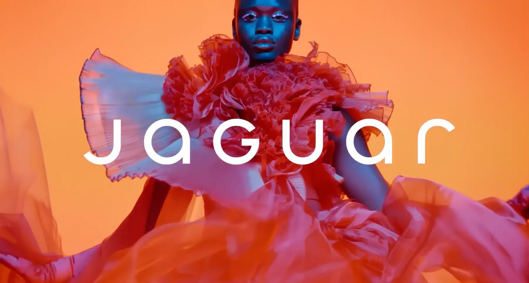
That’s what Jaguar has decided to do in a rather radical way. Gone is the British Racing Green and muted understatement. Also gone is the leaping large cat emblem. In their place come garish colours, androgynous models and a logo that has been likened to that of a perfume brand, or, erm, more intimate items.
It is safe to say that the Jaguar rebrand has caused a major ruckus among the automotive and marketing communities. How can they throw their heritage away? They aren’t even showing a car! It’s a scandal!
The rebranding has created huge controversy.
Elon Musk – owner of Tesla, a competitor of course – poked fun at Jaguar, questioning on his X network whether they in fact sell cars….
Motoring journalists have thrown up their hands in horror. Brown Car Guy says “Jaguar just lost the plot.” Of their new advertising, he snarls (someone has to, now that big cat has gone): “Ads that look like they’re pushing designer handbags rather than cars. They’ve swapped “It’s good to be bad” for “I’m stoked to be woke”. They’ve taken everything distinctive, everything that gave Jaguar an undertone of charmingly deadly villainy, and turned it into faux fashion for performative activists.”
But this isn’t just a party make-over; Jaguar has also said that it will actually stop producing cars until 2026, when it becomes an electric-only brand! They must be hoping that buyers’ memories are long and that there will still be a market waiting for them.
Brown Car Guy continues: “To cut production and divorce from its past petrol cars feels a bit like throwing the baby out with the bath water. It seems to be the complete abandonment of everything that defined them. No V12, no V8, not even a V6…. no roaring grand tourer, no growling saloon? No accessible sports saloon rival to a BMW 3 series? When they do return, they’ll be quieter than a strict library and will be targeting Bentley buyers rather than the everyman who just wants a slice of British class.”
So great has been the shock that some people are putting forward, rather hopefully, the notion that this must be an elaborate hoax. Will Jaguar pull a different rabbit from the hat and reveal their clever ruse to get people talking?
Well, whatever transpires, that is certainly what has happened!
Is it just Jaguar?
It is not just Jaguar; a host of other ‘legacy’ car manufacturers have also carried out rebranding efforts in the past couple of years. Albeit not as dramatically or with such noisy consequences.
They do all, however, reflect the industry-wide shifts towards electrification, modernization, and digital-friendly designs.
Let’s take Audi. It has not rebranded totally, but has recently launched a new word-only brand – still AUDI – for EVs in the Chinese market. It’s a big shift away from their familiar four interlocking rings logo. But it does actually look pretty good (a personal opinion). We haven’t seen any ads to accompany this yet, mind. Elsewhere, Audi has also flattened its rings to channel the minimalist trend.
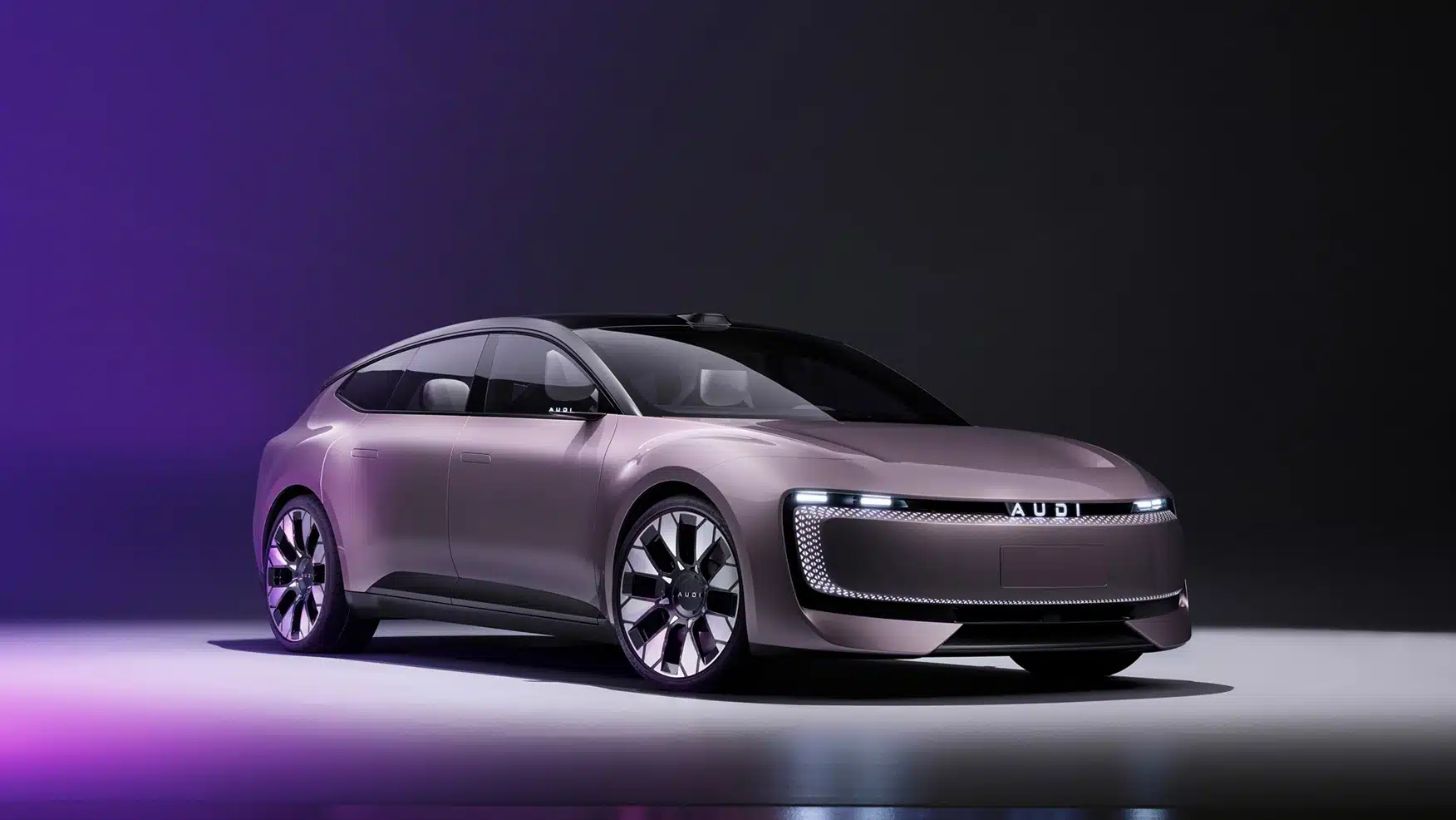
The AUDI E Concept with its logo for the China market.
In late 2022, Citroën unveiled an updated identity that returns to its roots, featuring a modernized version of its original 1919 logo. The new design includes the return of the oval enclosing the Deux Chevrons, signaling the start of a “dynamic era” focused on making electric vehicles more accessible.
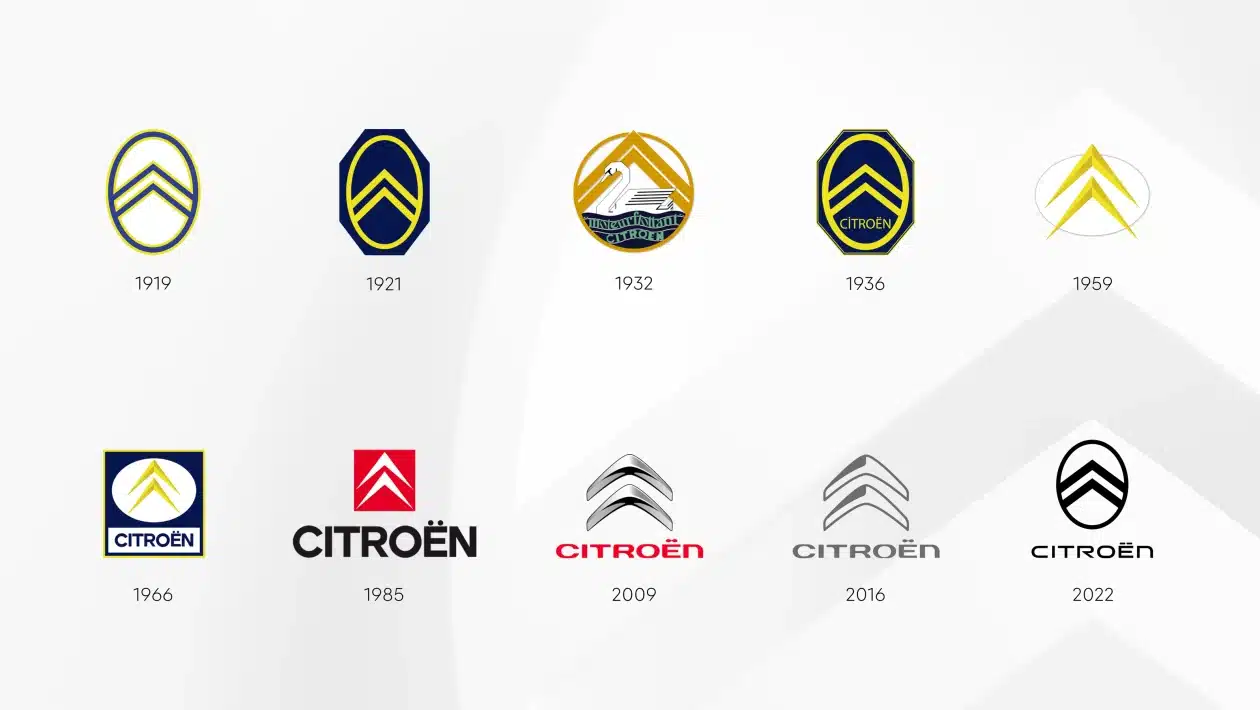
The logo history of Citroen over the years.
Volvo also quietly updated its logo in 2021, opting for a minimalist approach. The new logo is flatter, cleaner, and simpler than its predecessor, removing the rectangular housing for the Volvo wordmark.
GM introduced a new, brighter logo and a fresh ‘Everybody In’ slogan in 2021. The redesign aims to evoke “the clean skies of a zero-emission future” and highlight the company’s commitment to electric vehicles.
Kia fairly recently adopted an ultra-sleek new logo, moving away from its longstanding oval identity.
Peugeot chose to keep its own big cat – a lion – in their new badge. Moving it on from the previous, more heraldic styling, it’s now more MGM meets AI.

The list does go on. Some subtle, some more adventurous. But all designed to reflect a broader trend in the automotive industry towards minimalist, digital-friendly designs that align with the shift to electric and technologically advanced vehicles.
And let’s not forget that the Chinese EV upstarts were unknown outside their own country until about two years ago. With this sudden increase in brand choice for car buyers, it’s perhaps not surprising that the big beasts of the car world are running scared and, in some cases, perhaps making choices that appear irrational. Only time will tell!

